PROJECTS <

GRAPHIC IDENTITY / GRAPHIC SYSTEM / BRAND VERBAL SYSTEM
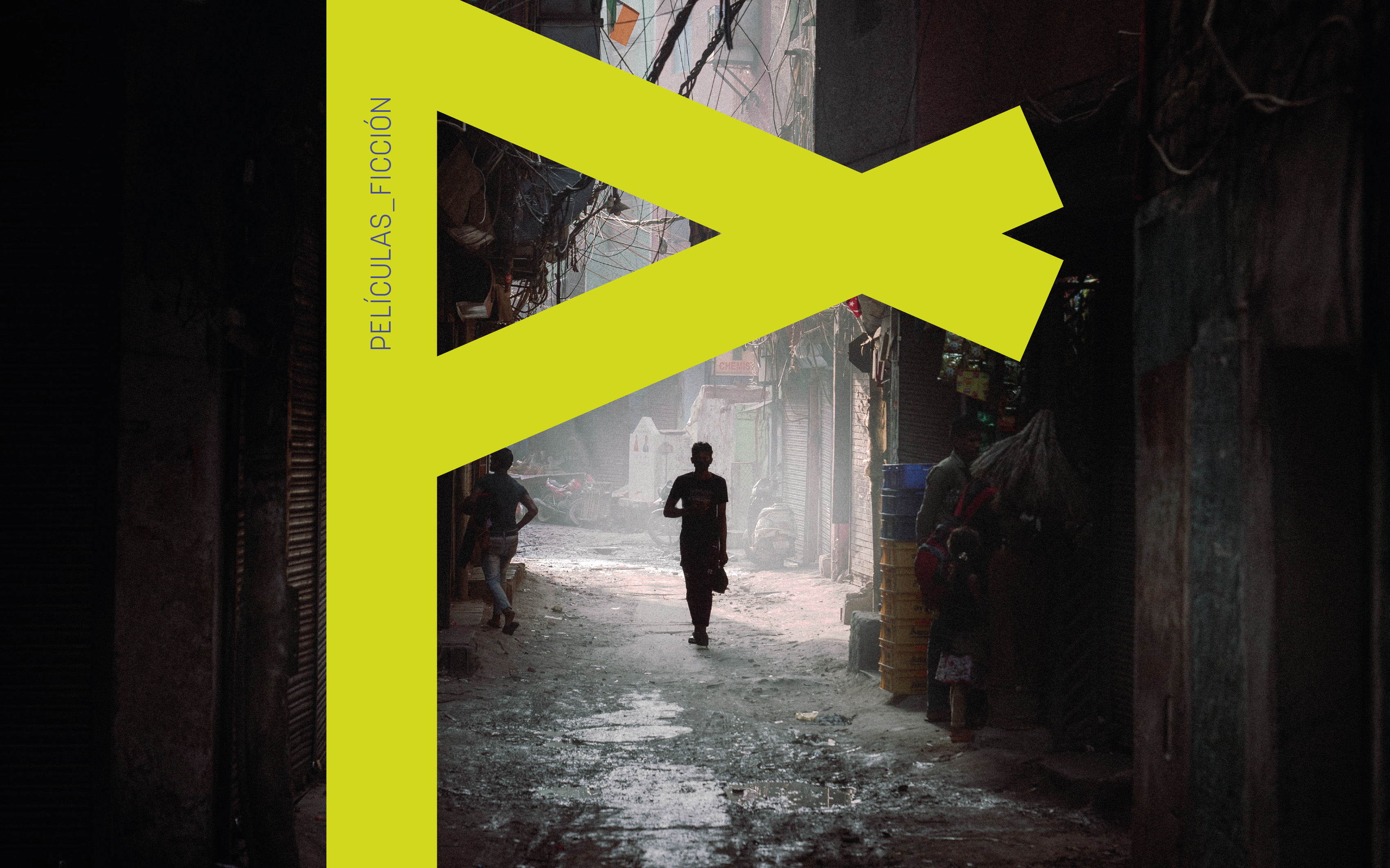
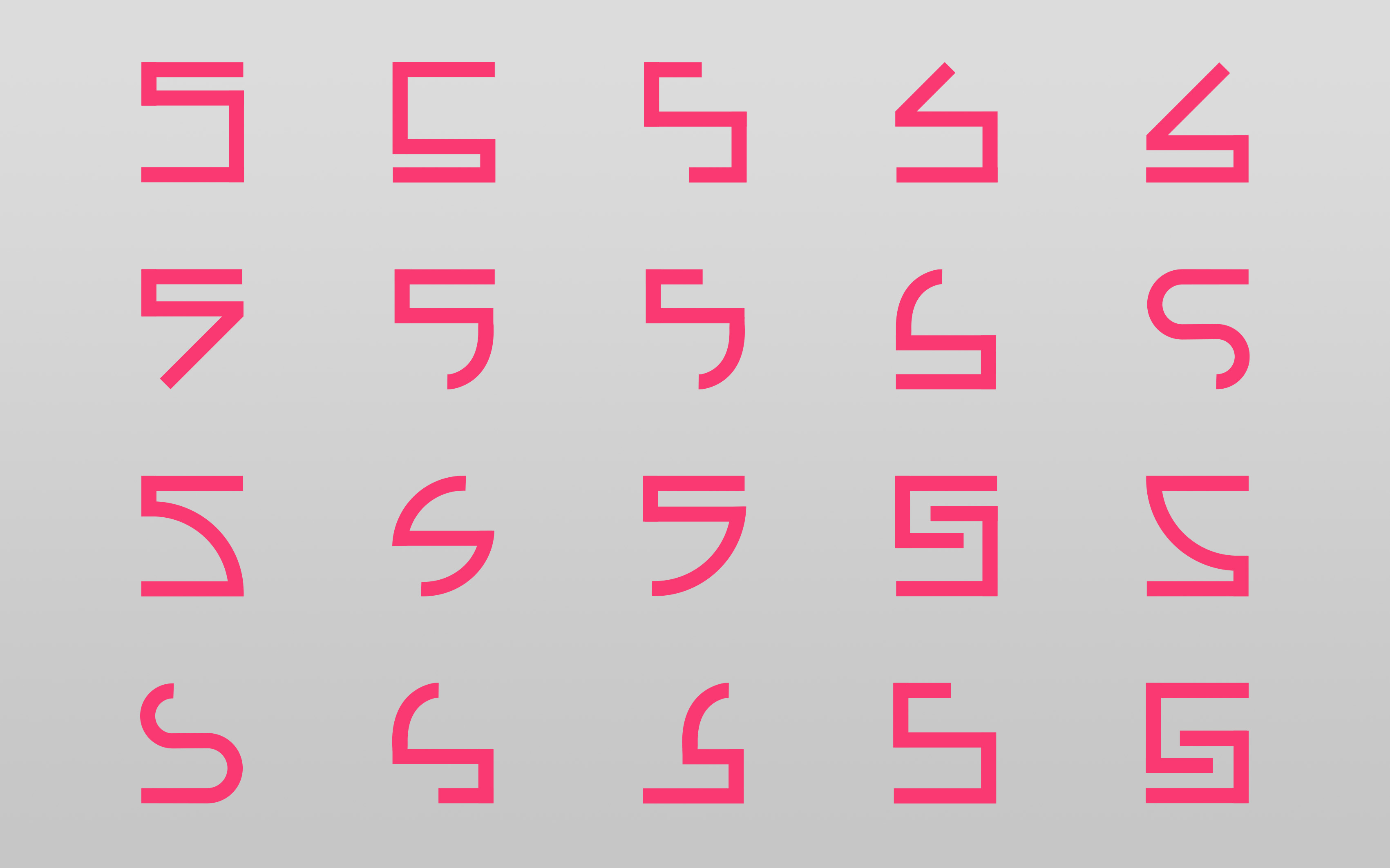
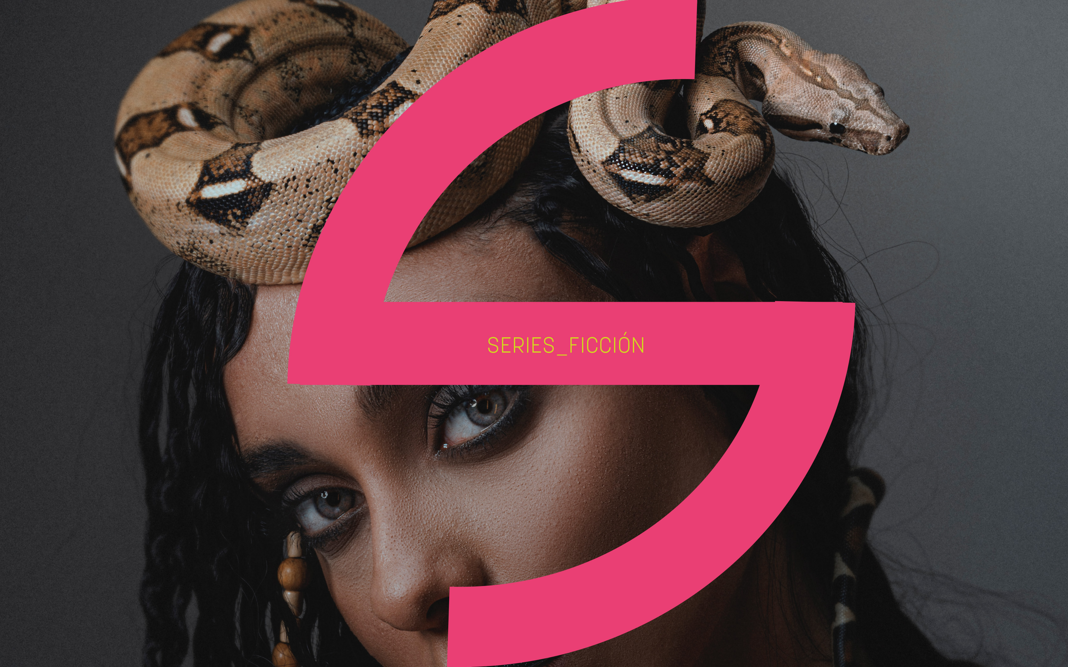
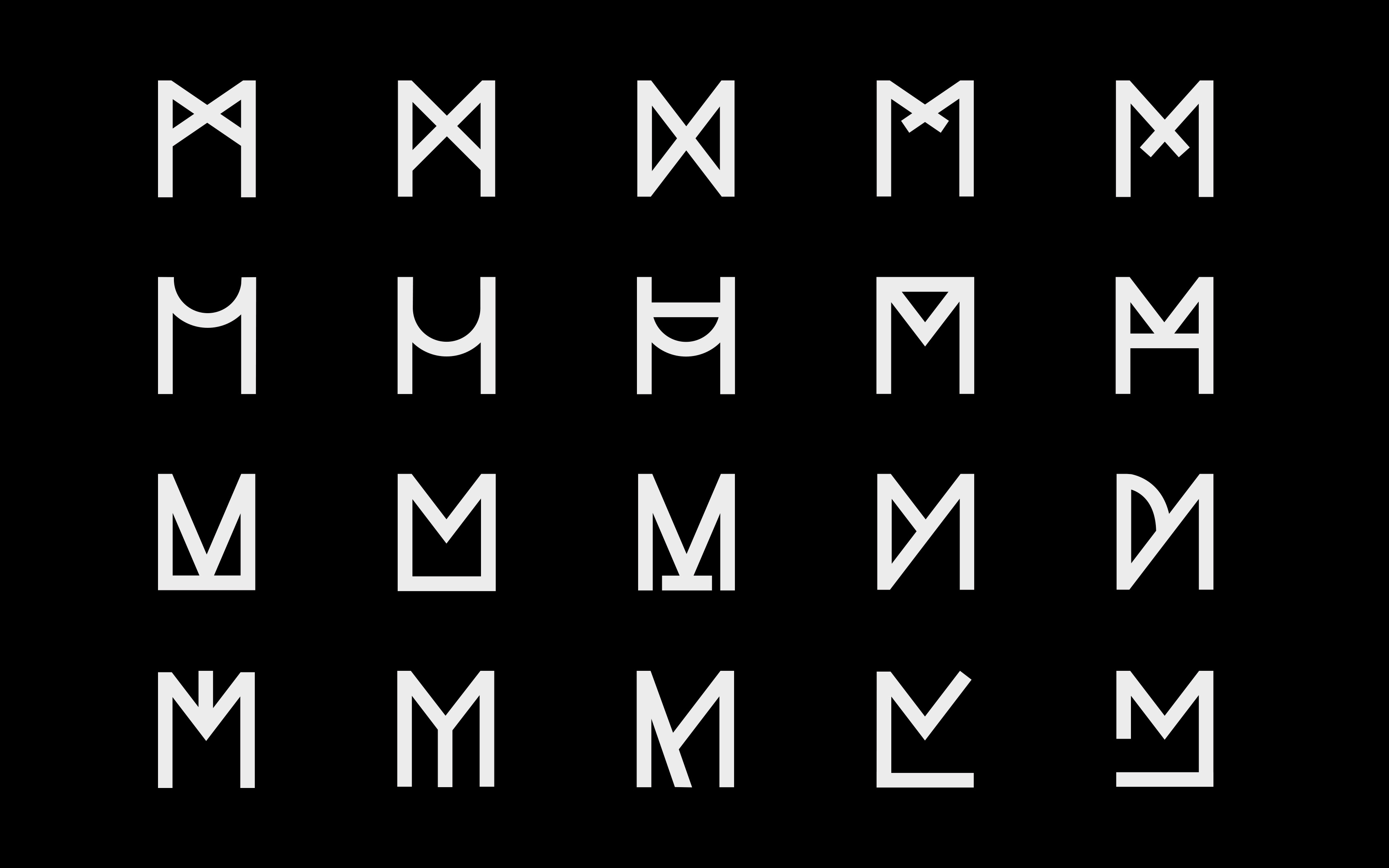
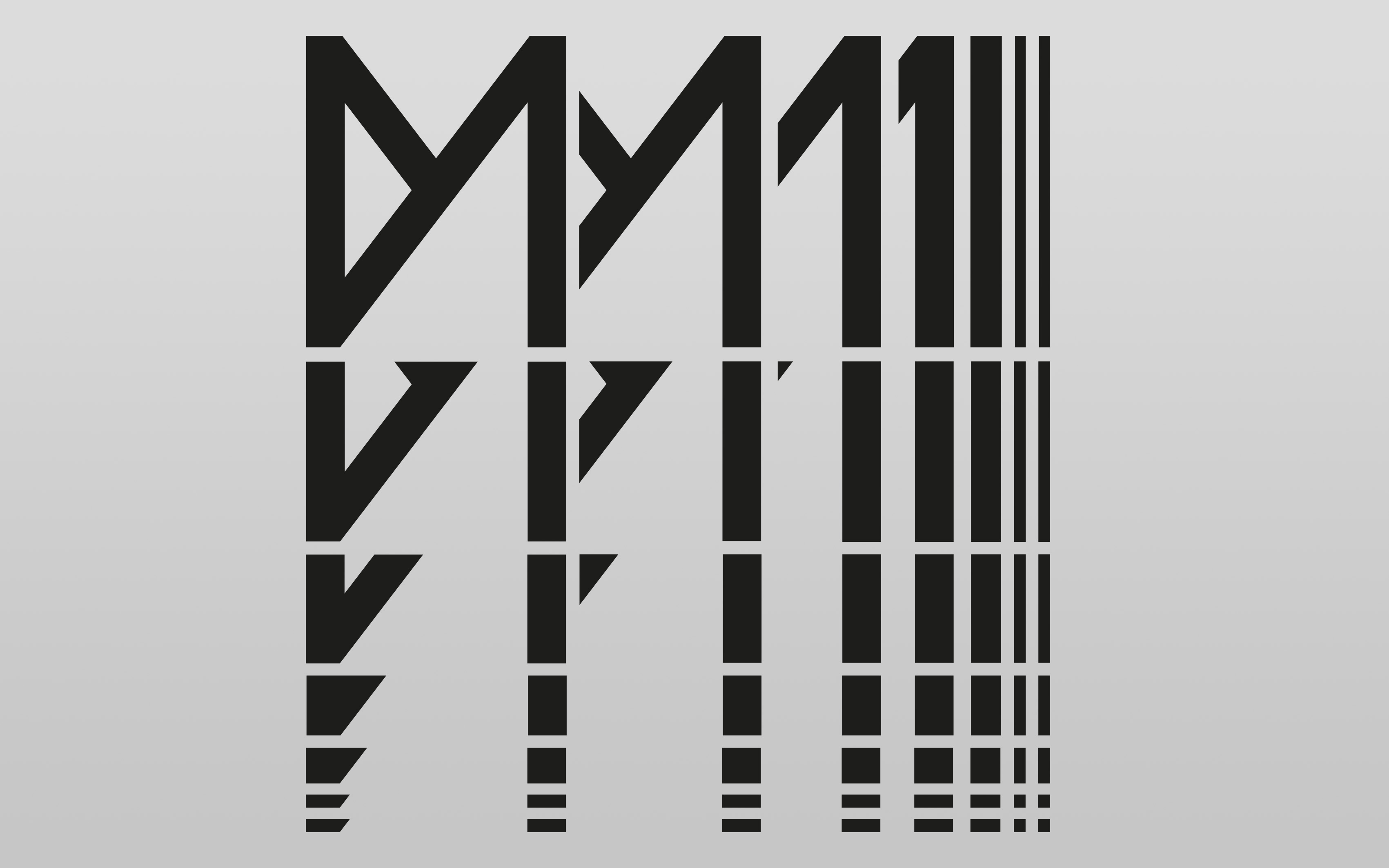
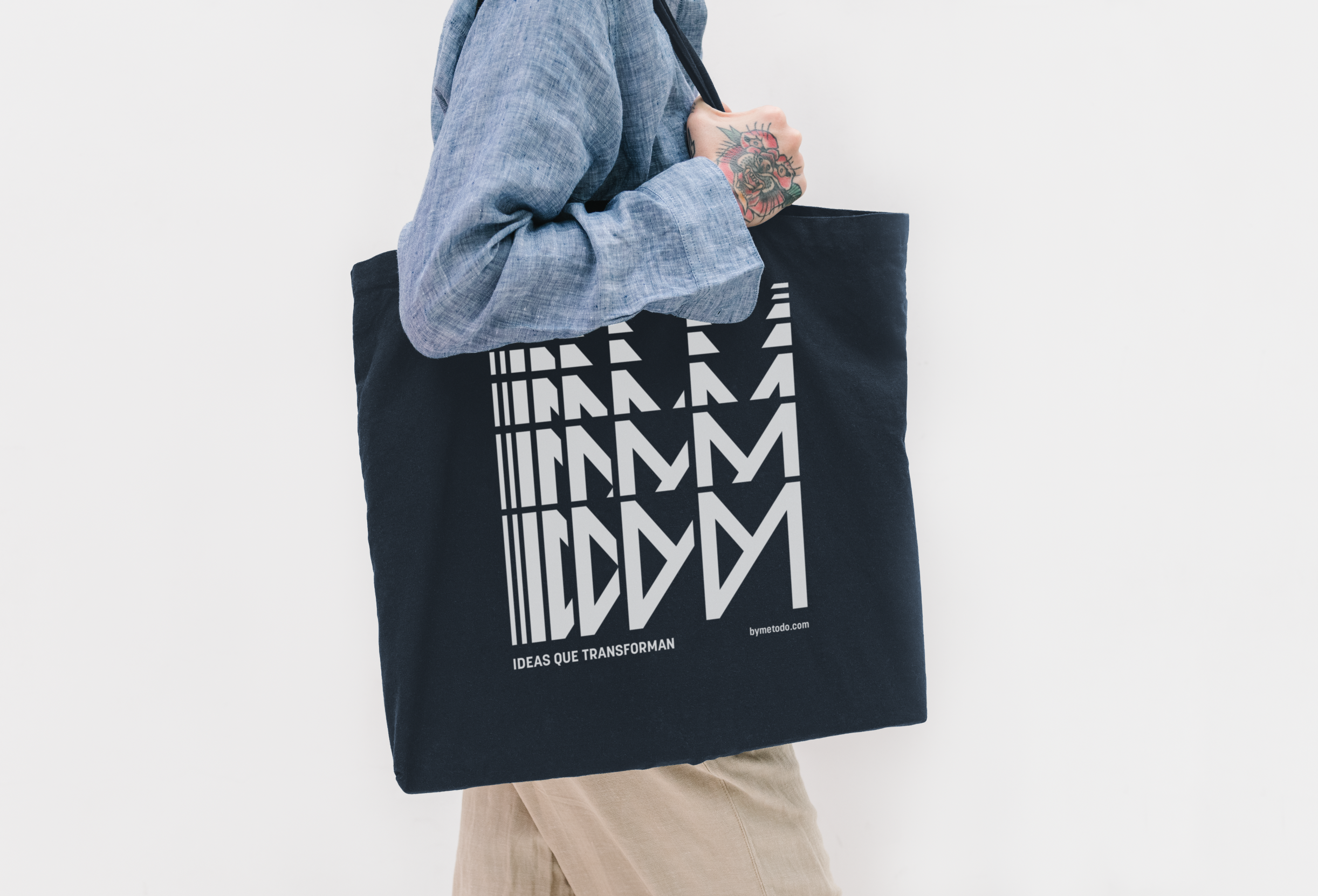
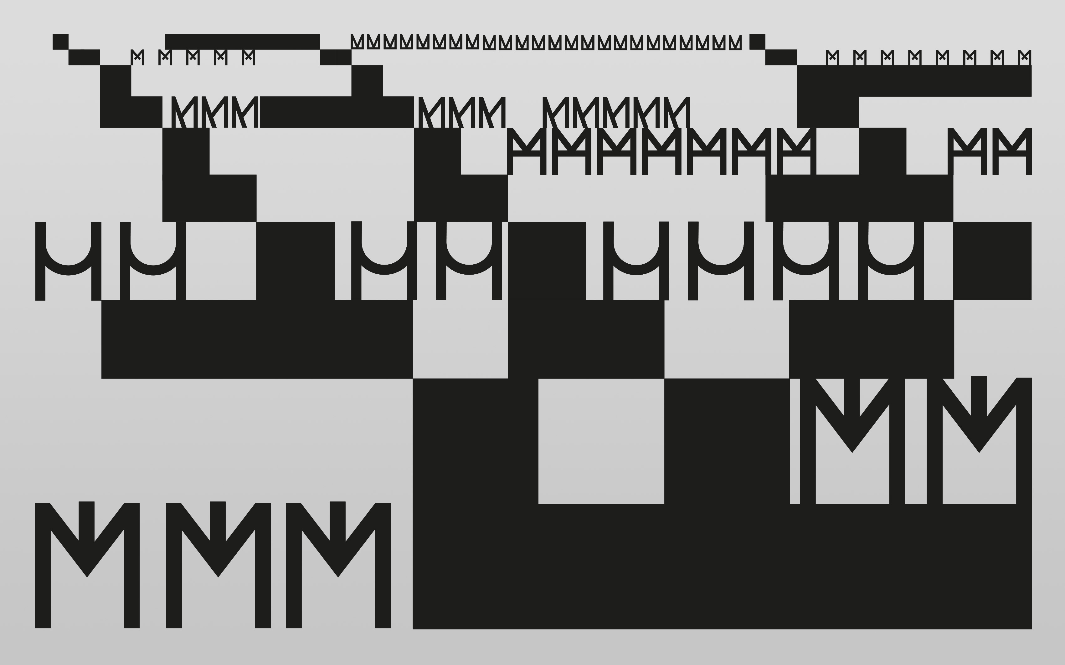
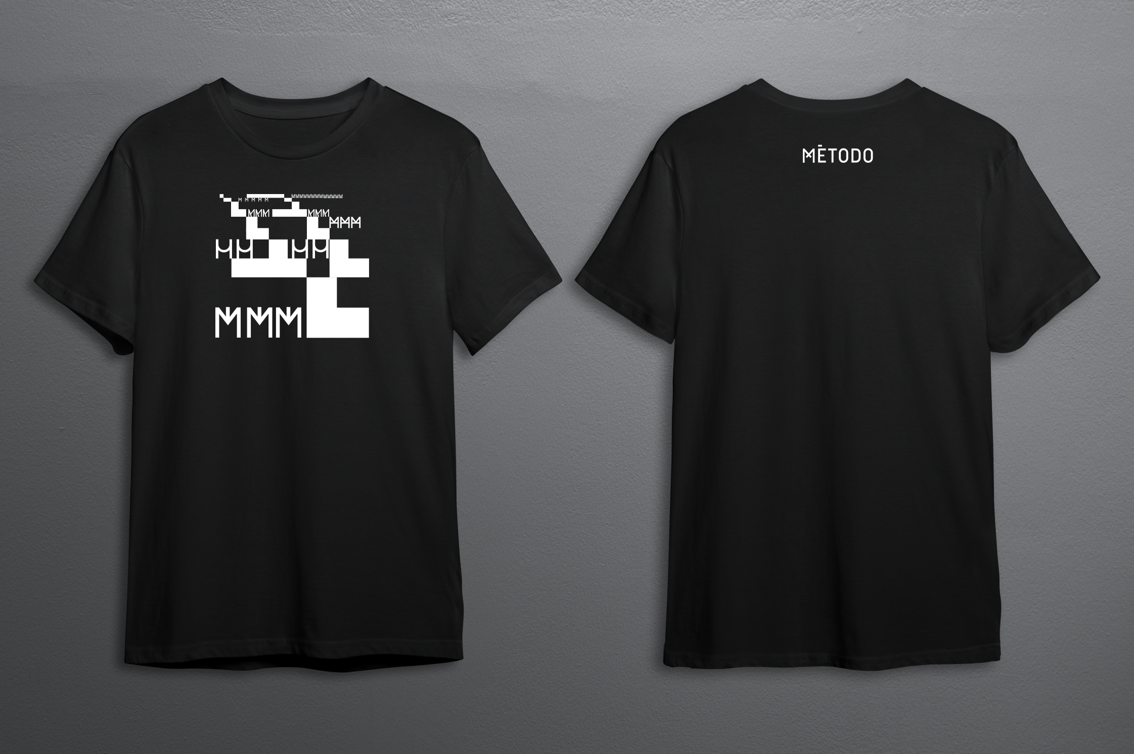
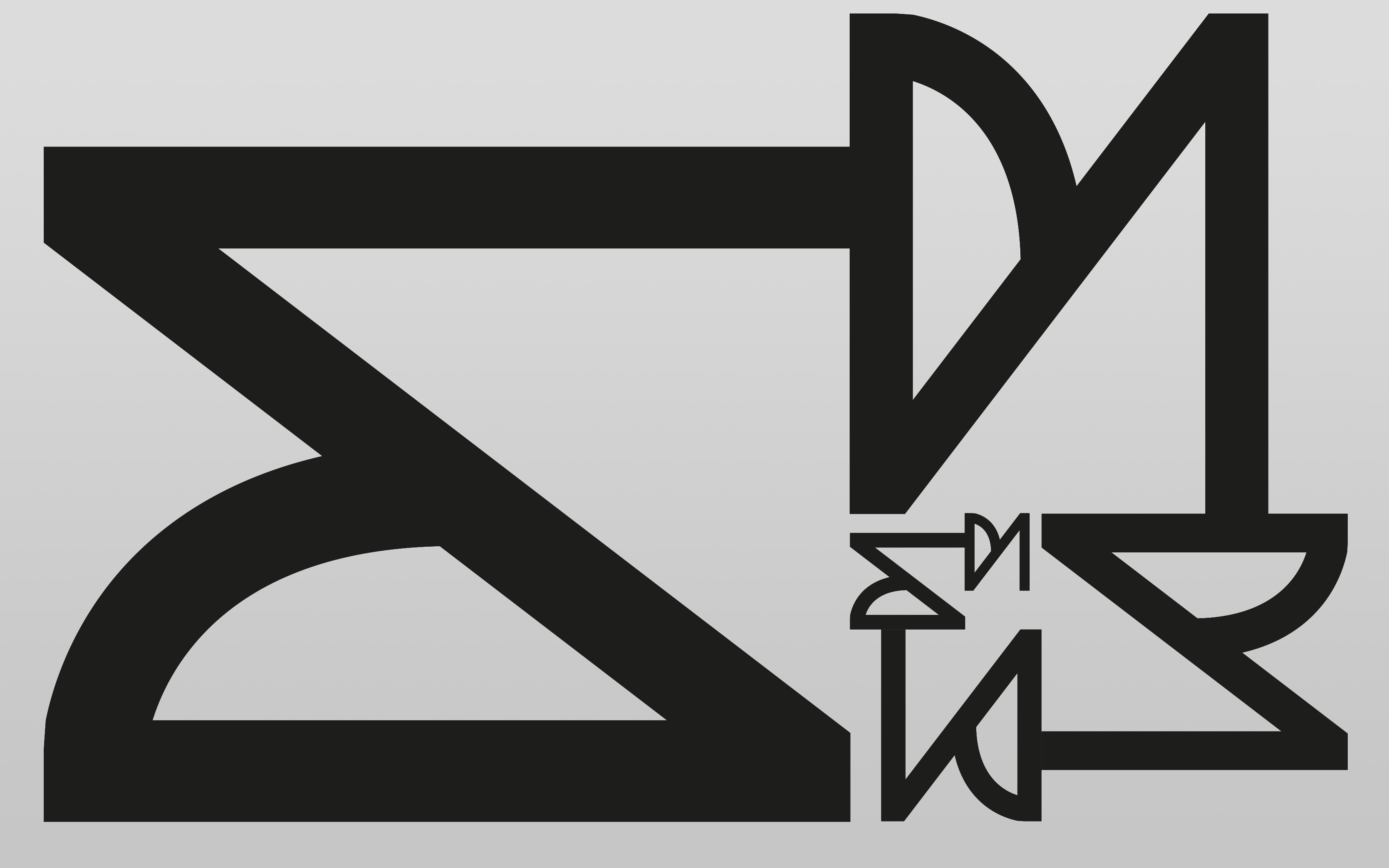
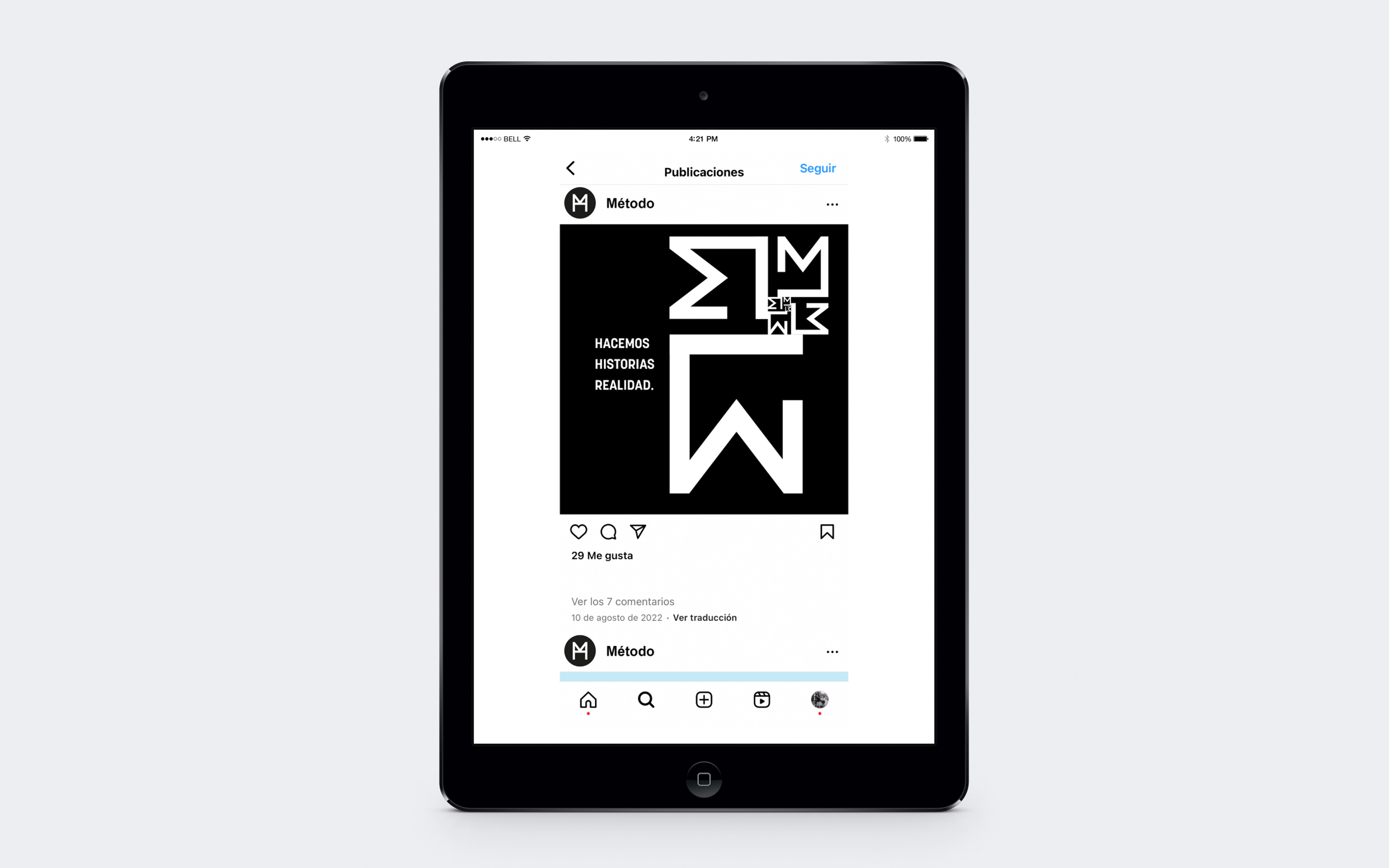
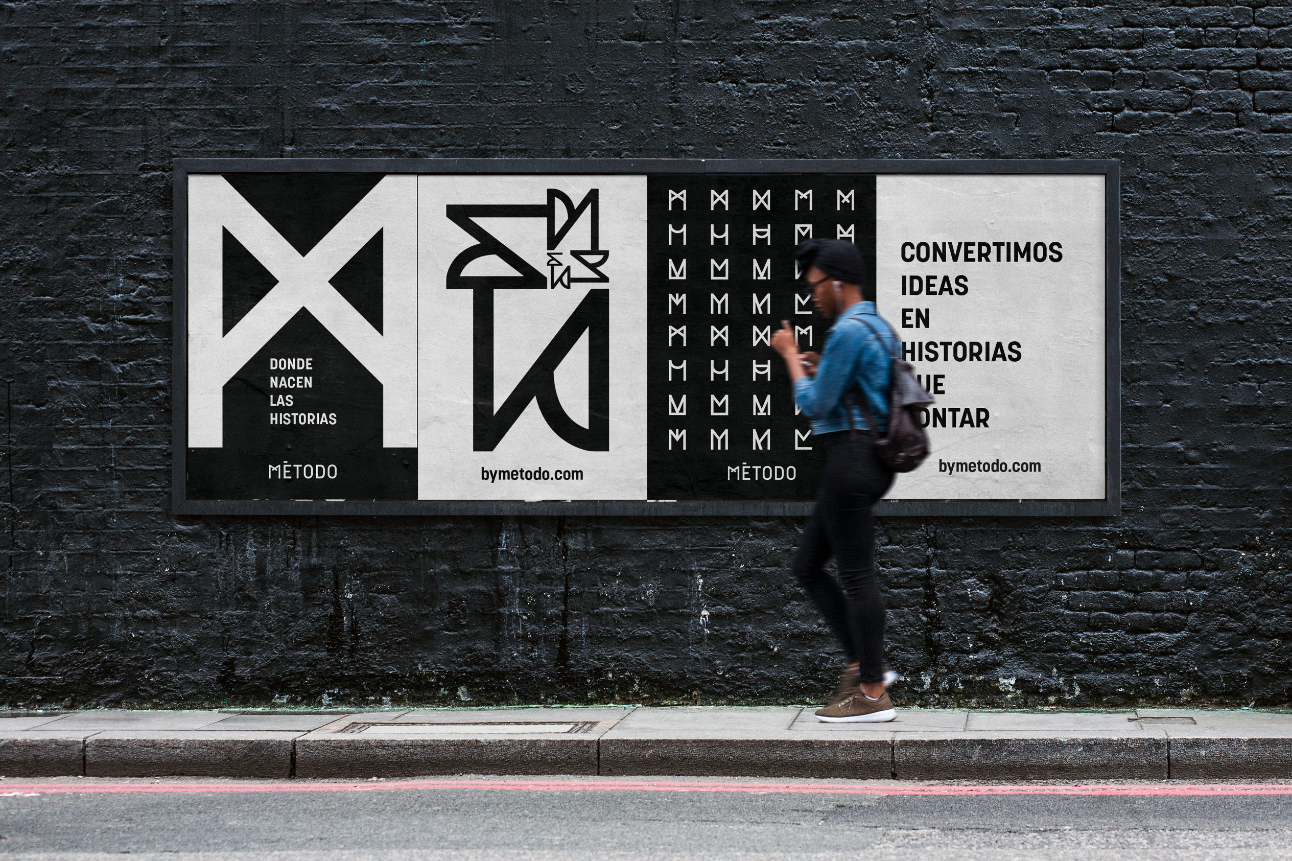
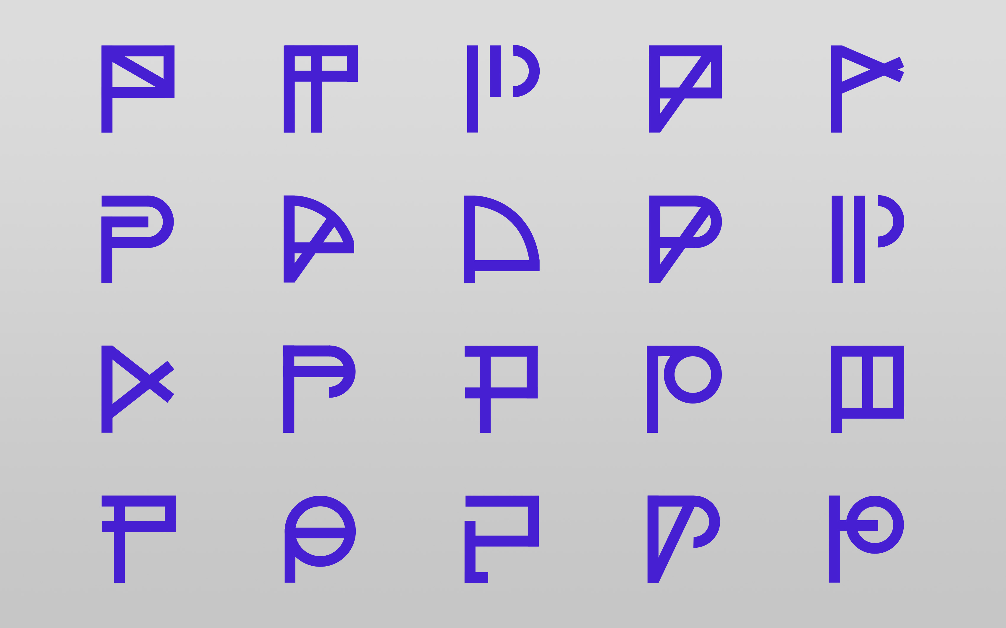
As a fundamental part of the brand, we designed a graphic and verbal system inspired by Fibonacci sequences, where repetition and scale play a crucial role in the way Método is expressed. The graphic architecture of the brand stems from the isotype, the various M's. Different forms of expression that a letter can take were explored, aiming to achieve a system under the same guiding principle but with the versatility for each area or line of work within Método to have its own character. While sharing the same DNA, each area or business line has its own system of expression. This helps provide clear guidelines for future areas or business lines that become part of Método.
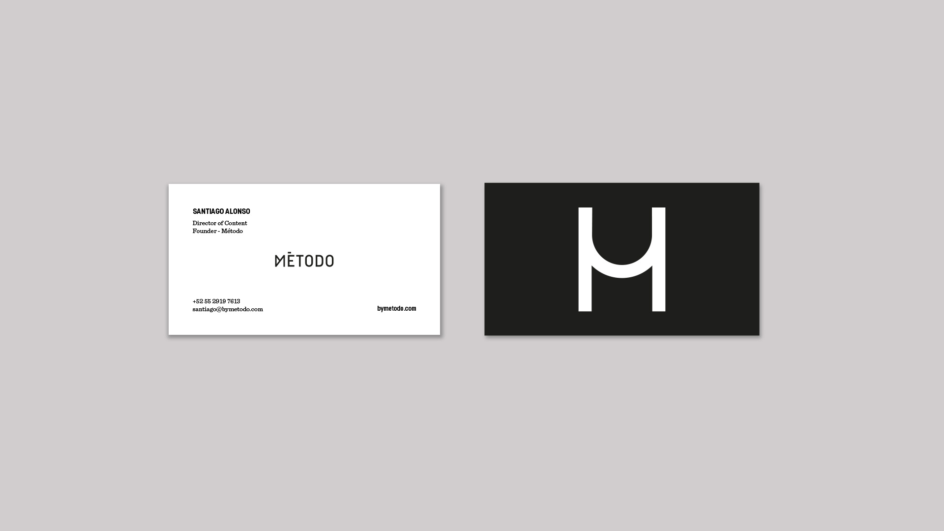
Método is a laboratory that generates ideas for the entertainment industry. They have their own, unique, and effective methodology that transforms ideas into stories to be told, which is why a fluid graphic identity was designed. The Método logo is composed of a variety of distinct graphic expressions within the letter M, where each expression holds the same importance, and there is no primary logo.
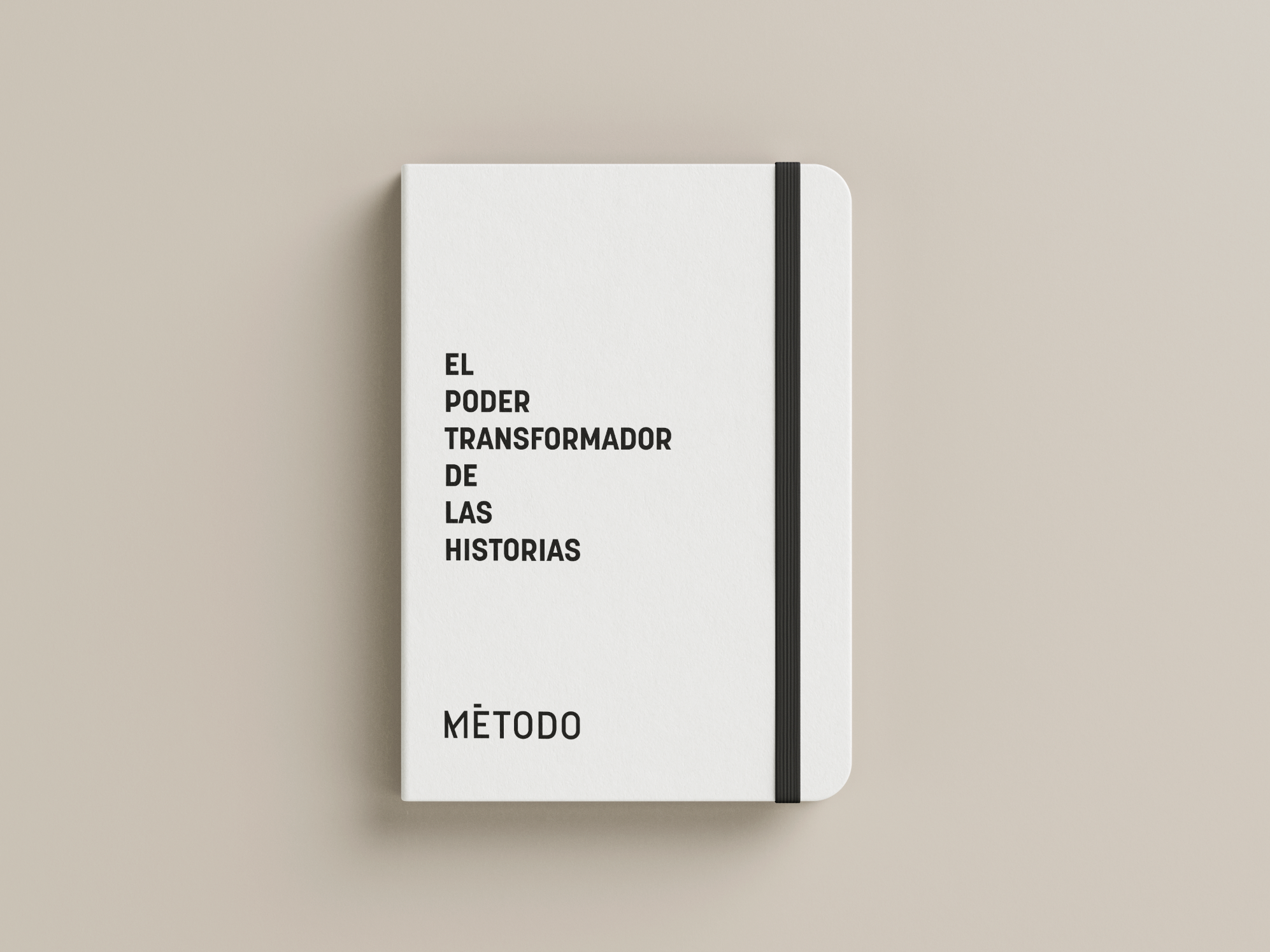
MÉTODO